Case Study
Implementing the responsive redesign of TIME.com
Working with the TIME.com web team, Doug Neiner and I implemented a complete responsive redesign of TIME.com to help make their content more accessible to readers across multiple devices.

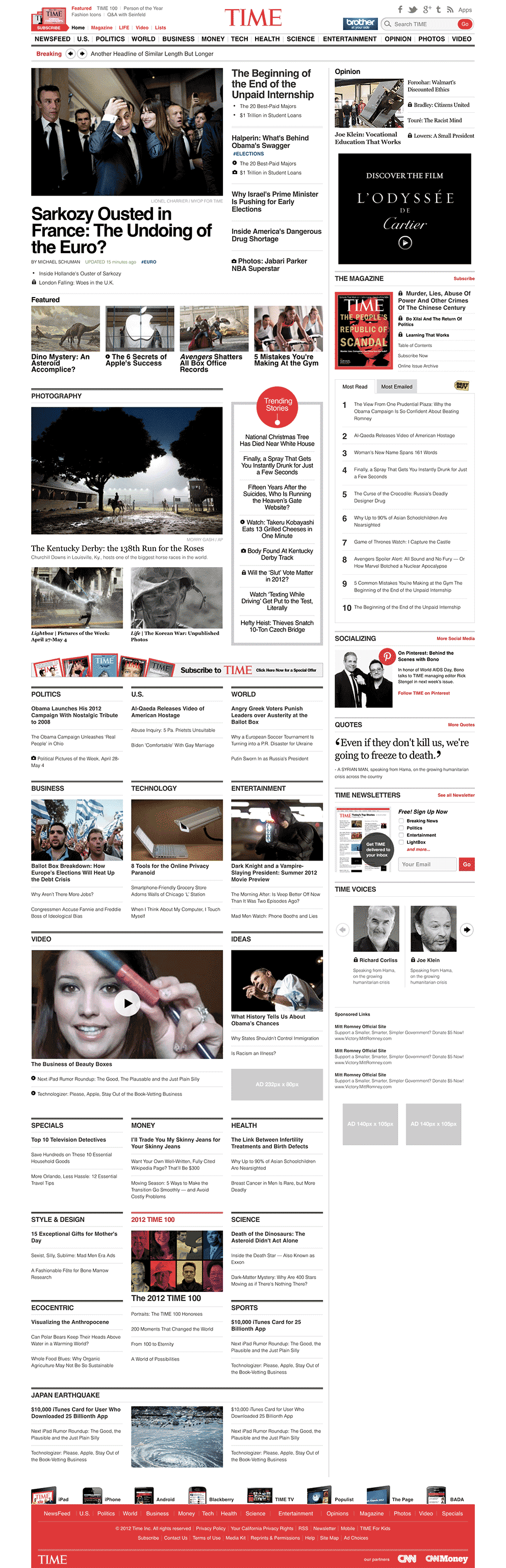
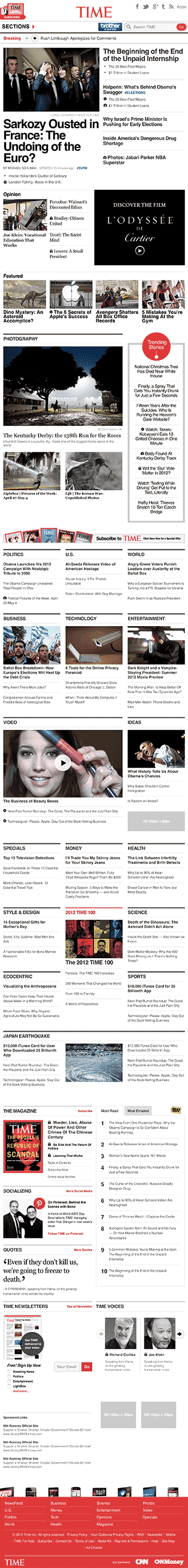
TIME Magazine has a rich history of content dating back to 1923. They’ve chronicled world events for decades, and their website is a treasure trove of news and history.
But in 2012 that content was optimized primarily for a desktop browsing experience.
In fact, the full archive of content back to 1923 was only available to desktop visitors, and visitors to TIME’s website were increasingly arriving at content from mobile and tablet devices which were not being served an experience on par with desktop browsers.
The Boston Globe, however, helped to usher in a new era of responsive web design by being the first major news outlet to feature a responsive web design – meaning it’s content adapted to the device viewing it for an optimized reading and browsing experience for that device, regardless of screen dimensions – an experienced which has since become assumed for modern websites.
On October 22, 2012, TIME Magazine followed suit by becoming the first global news publisher to launch a responsive web design.
As part of the team at consulting agency AppendTo contracted by TIME for the project, I implemented a responsive design for TIME.com along with Doug Neiner (technical lead) and Ralph Whitbeck (project manager).
We partnered with TIME.com’s in house design team, led by Davina Anthony, who provided the design for AppendTo’s implementation, consisting of more than 200 PSD comps of the various TIME.com screens at each major responsive breakpoint ranging from 1122px down to 320px.

Background
Prior to the redesign, TIME.com was optimized for desktop browsers and had a separate mobile site for mobile devices. However, that left an experience that had a lot of gaps for users increasingly coming from different sized mobile devices, tablets, and other non-standard screens.
What TIME really wanted was an experience that has become standard today, but in 2012 was still very new: a responsive website that adapted to whatever screen size it was being viewed on.
The responsive web design movement was still just beginning to gain traction, but there were already a lot of well established patterns and best practices in place thanks in large part to pioneers of the movement like Ethan Marcotte, whose A Book Apart book Responsive Web Design influenced an entire industry of web designers seeking to adopt this new approach.
We also took inspiration from Nicole Sullivan’s thinking on OOCSS, and Jonathan Snook’s Scalable and Modular Architecture for CSS book as we approached the best way to architect the CSS.
With responsive design best practices in our tool belt, we took to implementing TIME.com’s design into a functioning responsive website.
The build process
Doug Neiner and I worked together to tackle the dozens of views that needed to be coded from the over 200 PSD files that the TIME design team provided using a git repository to collaborate together and provide code access and full revision history to the TIME.com development team to take over after our work was complete.
We started by establishing a plan for how we’d work together and a framework for our workflow. The very first code commit made was a README establishing general development guidelines, documentation for our intended development directory structure, and instructions for how to use the static spike we were building.
This was an important step to make sure our responsive spike was easy enough for any developer or stakeholder on the TIME.com implementation side to clone locally and quickly get started working with the responsive code we wrote, as they still had the final step of wiring it up and integrating it into their content management platform.
Tooling
Front-end markup was written with HTML5, using semantically relevant elements like <header>, <nav>, <section>, and <article>. The TIME.com team also implemented their video player using HTML5 video. We used CSS3 for styling effects like rounded corners, shadows, gradients, and as many visual effects as possible to keep the page weight light.
We relied on the CSS preprocessor Sass (SCSS flavor) with Compass to help make our style authoring workflow light and easily maintainable during development. We used Compass mixins to solve for vendor prefixing and custom functions to make responsive math calculations on the fly.
We reset styles with Normalize.css, used Modernizr to detect support or lack of for specific HTML, CSS, and JS features, and used Respond.js to help bring support to older versions of Internet Explorer.
jQuery (at the time ver 1.7.2!) was our tool of choice for DOM manipulation and event binding. We used RequireJS for dependency management, and Backbone.js for view structure and components.
Responsive approach
Given the design decision by TIME.com’s team to utilize consistent spacing between layout elements throughout the design’s breakpoints, we chose to use margin and padding in absolute pixel values for most spacing, and allowed percentage based widths within a fixed max-width of 1122px to handle the responsive content flow.
To handle the sidebar which appeared on many of the template layouts and appeared at a consistent width until a much smaller breakpoint, we used a negative margin the same width as the element which effectively removed it from the block flow, allowing it to remain at it’s full width while the rest of the layout around it fluidly adapted to the viewport width.
An important guiding principal we followed during implementation in order to ensure a performant experience was to lean on CSS solutions over JavaScript as much as was reasonably possible, leveraging the browser’s CSS processing power.
Implementing TIME’s design also presented a few unique problems to solve.
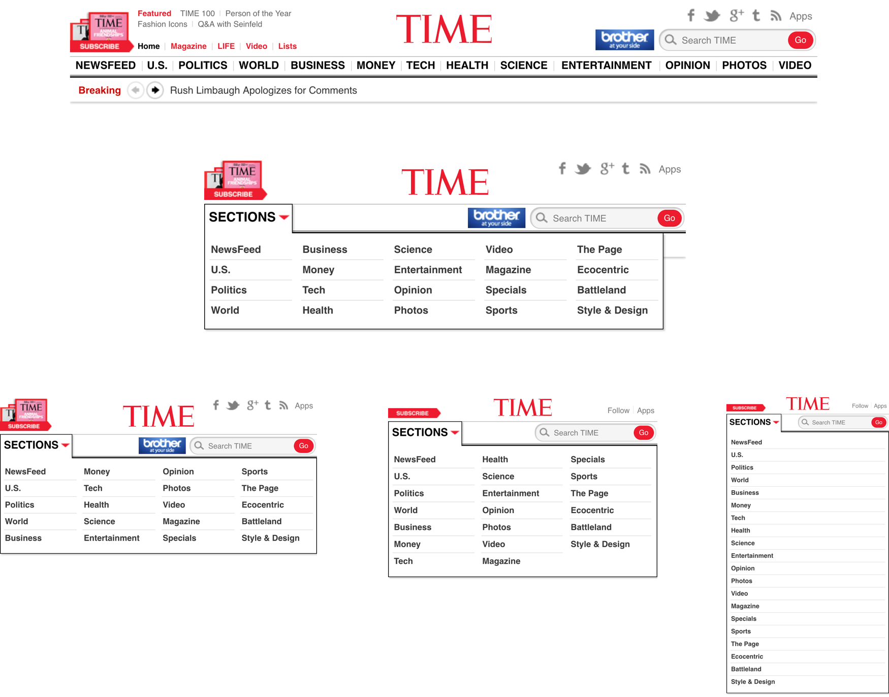
Transforming site header and footer navigation menus
The design of the site header and footer called for news section menus that transformed at major breakpoints between 1122px and 320px, reducing columns as the width shrunk down.
At full width, for example, the footer had a menu which displayed all items horizontally. At the next breakpoint down, the horizontal menu transformed into four columns, which then became three, and so on, down to a single column at mobile width.
This challenge could easily be solved today using media-queries to adjust a CSS columns property declaration, but at the time the property was not yet widely supported. So instead, we created pseudo-columns using percentage based widths and negative margins to offset the columns, selectively adjusting styles at each breakpoint to create the required columns and preserve Section ordering as defined in the design comps.
A similar design approach was utilized in the site header menu which displayed horizontally at full width and collapsed into a hidden dropdown menu containing a similar column structure at smaller widths.
An important consideration that the TIME.com design team made to help eliminate back and forth over design discrepancies and make implementation more efficient was to provide us with permission to make judgement calls about how to resolve inconsistencies. This allowed us to keep an aggressive pace of development and achieve the deadlines we committed to.
Most of the decisions we made in this context were related to design comps that left gaps in the design between break points. To resolve these issues, our approach was typically to insert additional breakpoints wherever the design broke at the current width, and apply styling to match the design comps at the next smallest breakpoint.
This was an important consideration for both TIME and our team, allowing us to ensure the design didn’t break at any given screen size.
With this approach, we were able to create a truly responsive experience that adapted to not only the most popular devices at the time, but would also be reliable for devices that would be released in years to come.
Pseudo responsive advertising
Another challenge we faced on the implementation was solving for a key business requirement of the redesign – responsive ads.
TIME needed to allow existing advertisers to continue using their existing ad creatives, which meant the responsive implementation needed to be flexible enough to accommodate traditional ad sizes.
To solve for this requirement, we created a wrapper around TIME’s existing advertising solution that allowed the ad regions to adapt to the available screen real estate and serve the correct ad format.
TIME also wanted to serve targeted ads for mobile, tablet, and desktop browsers with device specific creatives. Since our implementation was device agnostic, Doug Neiner took the lead on solving for this requirement by porting an existing server-side solution to a JavaScript implementation that could determine the correct ad to serve at render time in the browser.
The final requirement for TIME’s responsive ads was the ability to swap out ad creatives if the layout changed based on a browser resize (such as a device change in orientation) without triggering a page reload or inflating ad impression metrics. We worked together with the TIME.com web team to implement a solution based on some existing functionality from TIME’s site.
TIME was pleased with our approach and it’s advertisers were as well.
We wanted to embrace our existing advertisers, not limit them – so we set a guideline for the use of traditional advertising sizes. The ads, however, needed to work in a fully responsive environment. appendTo produced a custom wrapper around TIME.com’s existing advertising solutions. This made the ad regions aware of the available real estate so the correct advertisement could be loaded on all devices. We’re happy and our advertisers are really happy.
Davina Anthony, TIME.com Design Lead
When the redesign landed in October of 2012, it was a big success. Craig Ettinger, General Manager of TIME.com, said they saw a 23% increase in pages per visit following the move to a responsive site.
The responsive redesign was a strong move from a global leader in online media content, contributing to the momentum of a significant movement in the progressing history of the web. It was only a matter of time until many other major news and media websites followed suit, and I’m proud to have been a part of that work.
In retrospect
Looking back some six years later (as of this writing in 2018), I’ve identified a few key insights from working on the project. Asking questions like “what did I learn” or “what could we have done differently” reveal a few things worth sharing.
What did we learn?
Doug and I both learned a lot from the process. Coming in to the project, we had both built responsive websites before, but not quite to the scale of a project like TIME.com.
To accomplish the project effectively, we knew we’d need to lean on expertise beyond our own, so we spent time digging into a few key resources prior to engaging in the build process. The one’s we drew the most influence from were:
- Ethan Marcotte’s book Responsive Web Design
- Nicole Sullivan’s Object Oriented CSS ideology
- Jonatha Snook’s Scalable and Modular Architecture for CSS
Still, despite our experience, and thorough research and preparation, few things can fully prepare you for the realities of real use. The project gave us many opportunities to encounter use cases that simply weren’t covered in prior art, and project requirements that pushed us to explore new territory (such as the responsive header and footer menus, and responsive ad approach discussed above).
I also learned about the dynamics of consulting with a large organization.
While Doug had worked for appendTo for some time prior to this project, consulting with organizations like the Walmart.com team, this was my first project after joining appendTo. Prior, I’d worked on an in-house team at an NGO, and been a consultant for several years to much smaller organizations.
The chance to work on a project with a tightly organized team like TIME was a new experience that introduced me to workflow dynamics at a new scale.
Keys to success
A few things the TIME team did really well that helped make us more effective as their consulting agency:
- TIME had a well defined stakeholder and project communicator. While we maintained communication with various members of the team at TIME, Davina Anthony was our primary point of contact person. She was able to make project decisions clearly and definitively on TIME’s behalf, which mean we weren’t at risk of scope creep or conflicting signals.
- They providing well defined design comps, and allowing us the freedom to make judgement calls on implementing them. This kept us from wasting time in development seeking clarification or approval on minor decisions.
- In addition to regular stand ups with TIME, they were available for regular communication when needed. This meant that when we did need clarification, we weren’t blocked awaiting responses for excessive amounts of time.
On our end, some things that helped us work efficiently and effectively were:
- Taking time for technical research prior to diving into the work. As mentioned above, we invested a meaningful amount of time in breaking the technical problem wide open and exploring approaches, intentionally selecting the best approach for the project.
- Having just enough team members but not too many. For a project of this size (over 200 design comps to match), a single individual contributor would not have been sufficient. But likewise, adding too many people would have only yielded incremental results while introducing the added cost of team coordination. In our case, a team of three – a project manager responsible for client communication, a technical lead responsible for technical decisions and more technically complex requirements, and an individual contributor focused on broader implementation – turned out to be just right.
- Treating the work as if we were building a framework for someone else to maintain (because we were!). That requirement provided an important constraint that we embraced, helping guide key decisions from build configuration to source code management.
What could we have done differently?
At the time of the implementation, the mobile first movement had just begun, and was younger than even responsive web design. We considered a mobile first approach, but ultimately decided on a desktop first approach to implementation.
I’m not sure how the design process went on the actual design and layout of the site, so I can’t speak to whether TIME designed the work from a mobile first perspective, but in our approach to implementation and communication around the implementation, we didn’t give much thought to a mobile first mindset.
This was largely because the requirements for mobile and desktop were basically the same. The same content had to appear in both places as a requirement, so there didn’t seem to be much reason to consider mobile first practices in the implementation.
In our implementation, we started at desktop width and added max-width media queries to adjust styles accordingly at each smaller breakpoint, a practice we used consistently when approaching the overall site structural elements and individual page layouts.
In hindsight, however, I don’t know that it was a mistake to take this approach.
We gained a lot of efficiency from working in a way that we were already familiar with, and workflow efficiency was critical to achieving the necessary deadlines for the project, and it’s not clear that we would have gained much in the technical implementation by a mobile first approach.
Final thoughts
The TIME.com project was an incredible experience in implementing a responsive web design for a large scale content website.
Today, there are a large number of tools for responsive design, from responsive boilerplates and grid frameworks, to preprocessor mixins, and build tools, many of which were not available to us in 2012.
If you are implementing a responsive design today, do some research to discover the best tools for your project, look to voices in the industry and listen for new trends and best practices to adopt, and identify the constraints that will help guide decisions based on your project requirements.
Balance technical perfection with practical sufficiency, and find the sweet spot between solving the problem and engineering a perfect solution.
Oh, and remember to test on more than just Apple devices.
😊🖥📱